Book Cover and Endpaper Illustration for Never by Jessa Hastings
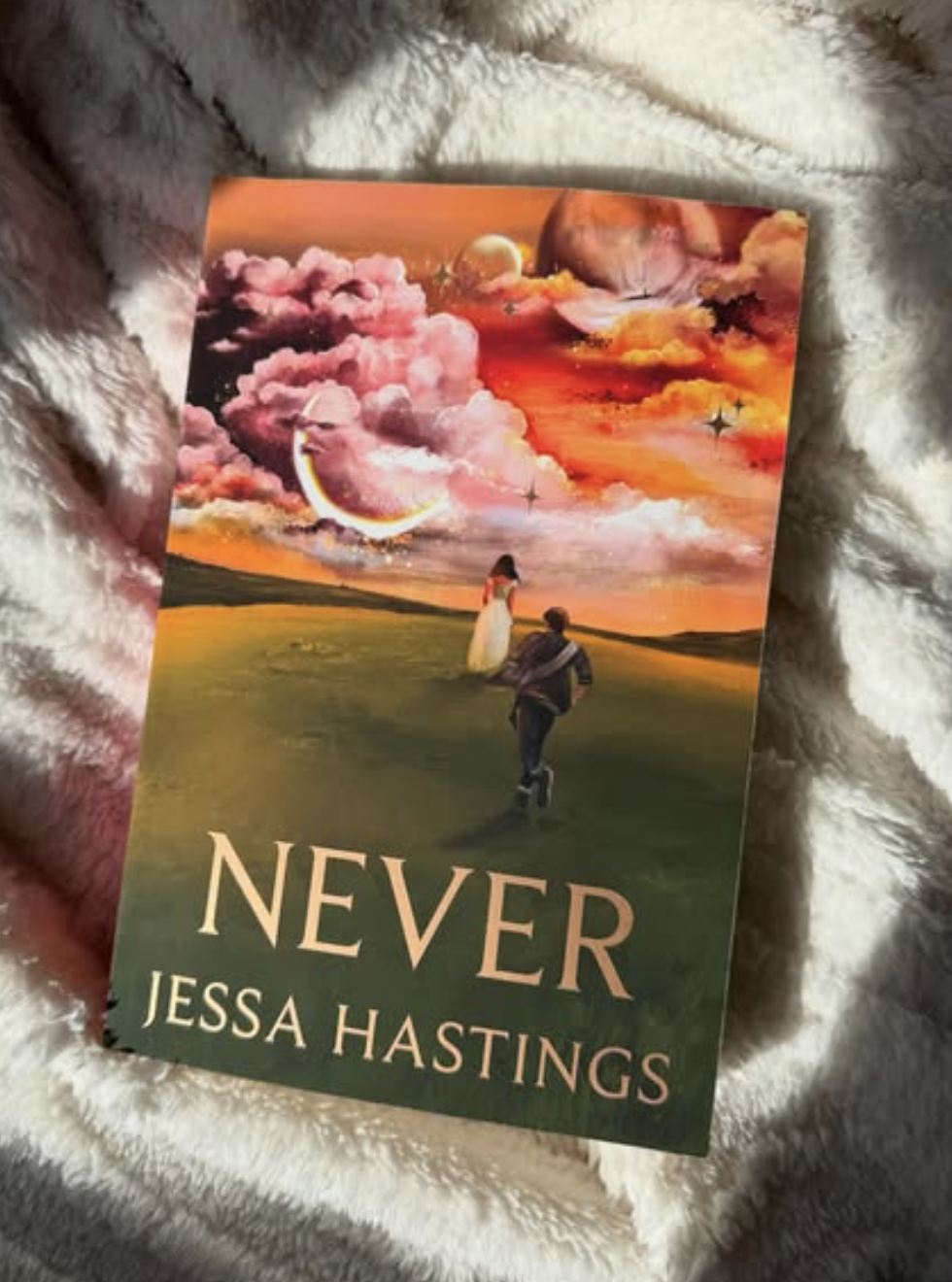
Book Cover Illustration for Never by Jessa Hastings
Creating this book cover resonated deeply with me, evoking a wave of nostalgia and emotional intensity that connected me to some of my most magical memories as a kid.
Never by Jessa Hastings took me back to those timeless places, and the creative journey felt like rediscovering wonder through adult eyes.
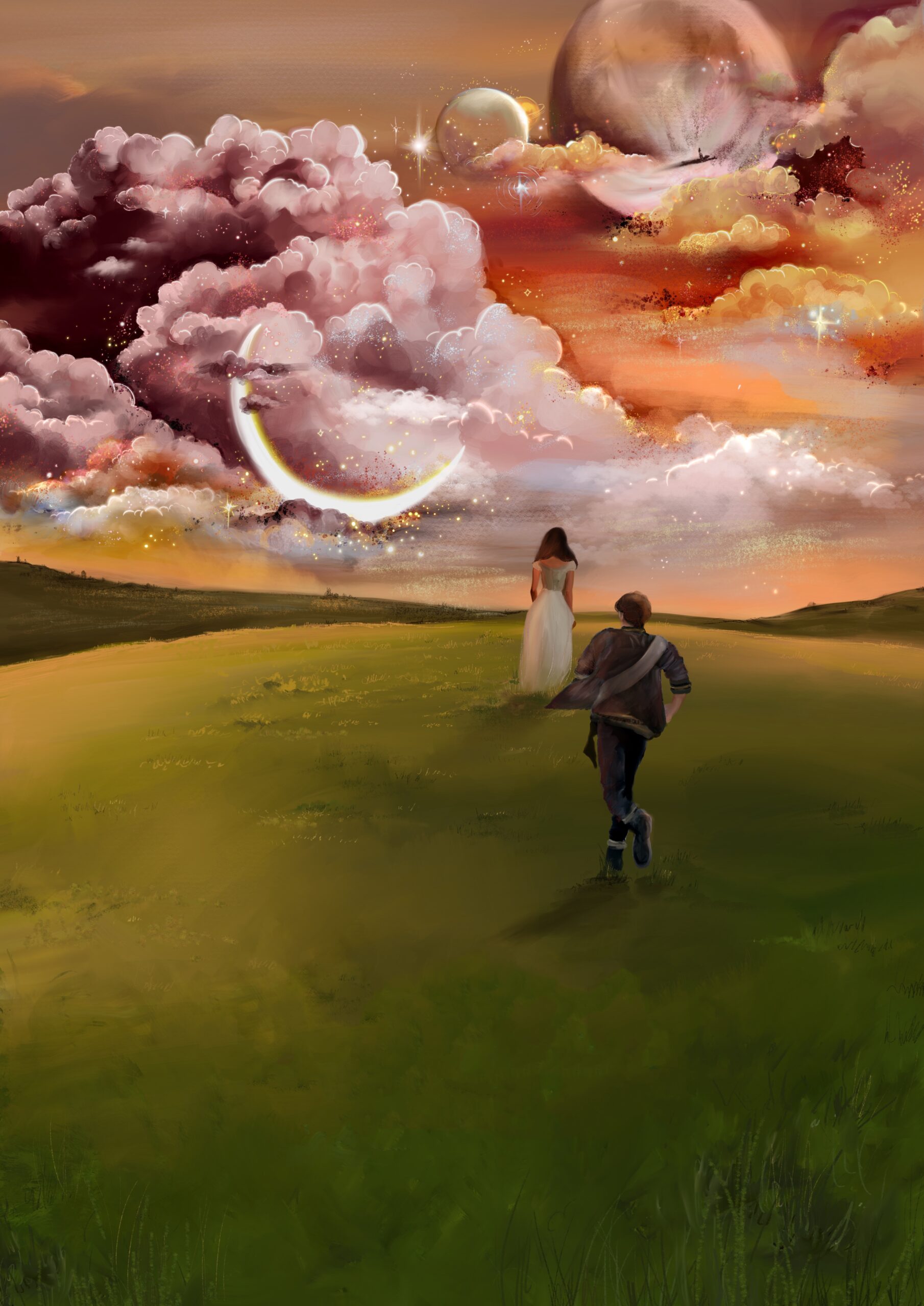
The cover captures the essence of that feeling: two figures standing at the edge of the universe, painted in colors of a memory—sunset pinks and Florida greens, inspired by a moment Jessa shared from DisneyWorld.
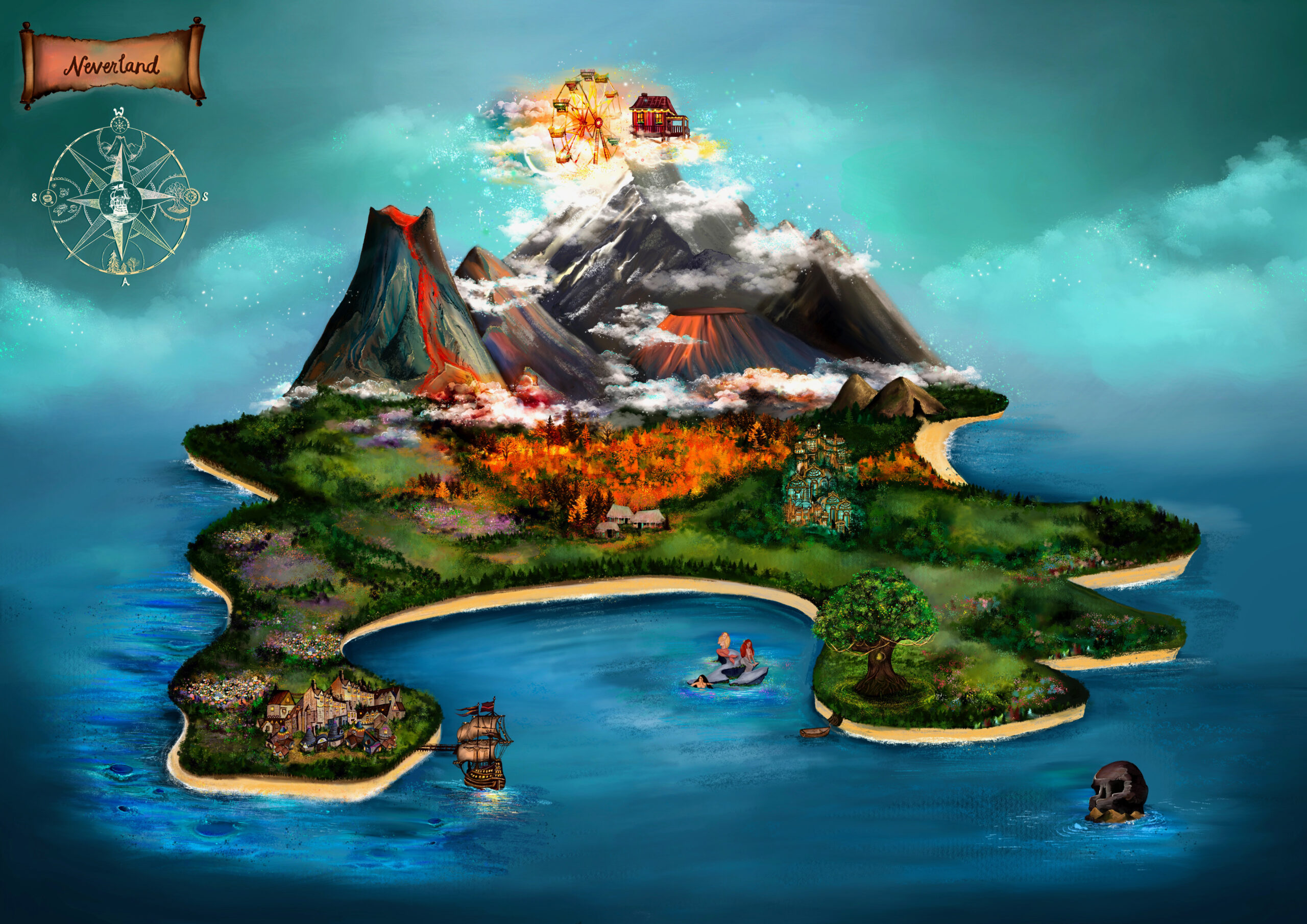
This palette became the spirit of Never, merging dreamlike colors with a story that’s as enchanting as a Neverland map in the endpapers, a nod to the maps we adored growing up.
Inspiration & Emotional Resonance
Jessa Hastings’ Never is an emotional, mythic retelling of the Peter Pan legend—filled with longing, nostalgia, and the tension between childhood dreams and adult heartbreak.
My goal as the cover artist was to translate that feeling visually: to capture the beauty of lost innocence and the ache of growing up, while still evoking the sense of wonder and possibility that defines Neverland.
This project reminded me how powerful visual storytelling can be when it connects directly to shared memories and emotions.
Design Concept: Color Palette & Meaning
The foundation of the Never cover is its color story—sunset pinks and Florida greens.
These hues were inspired by a moment Jessa shared from DisneyWorld, a place rich with both nostalgia and magic. The palette bridges memory and fantasy: pinks that recall soft light at dusk, and greens that hint at tropical warmth and innocence.
Together, they became a visual language for the story—blending emotional depth with an ethereal glow that mirrors Jessa’s lyrical writing style.
Visual Elements: Silhouette, Horizon & Map Motif
The final artwork features two figures in silhouette, one reaching and one waiting—an echo of the novel’s core relationship and its themes of longing, destiny, and the passage of time.
The sweeping horizon line hints at a star beyond the stars—an allusion to “the second star to the right,” guiding the way to Neverland.
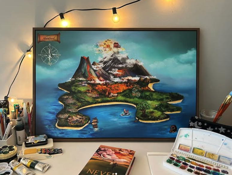
Inside, the endpapers extend this motif through a hand-painted map of Neverland—a nostalgic nod to the maps we all grew up tracing with our fingertips, now reimagined through adult eyes.
The Story Behind the Illustration
As a book cover illustrator who blends traditional painting with digital art (Procreate), I wanted this design to live between two worlds: the tactile and the fantastical.
It’s a visual metaphor for what Never itself explores—the pull between memory and imagination, between who we were and who we become.
Every brushstroke was intended to evoke the fleeting shimmer of memory—something just out of reach, like the edge of Neverland itself.
